We did a gaming presentation in Friday’s lab last week. We were showing the ideas of our strategy game about college life. We explained our characters, audios, gaming rules and mechanics.
In our gaming presentation, I think we did a great job on classifying our game characters. The five social circles that we think are interesting and fit the real college life. And we create the sample of our characters. Their outfit, hairstyle, accessories and etc identify them clearly. These elements are showing the tradition of American college life especially for me as a foreigner. I think target the potential players for game is an important job during creation. Unfortunately, we don’t clear explain our game’s goal and how our game is fun to play on the presentation. I think the additional important goal of our game is let people experience American college life. For example, I had not ideas about American college life before I came to American. When I still in China, I was afraid about what would happen when I arrived here. If there was a game like ours at that time, I could play and see what were the common characters and events that would happen in the future. I think I might get lots of help from these kinds a game at that time. So our game can especially help the players who are outside of this country and want to know American or American college.
I think the most difficult thing to discuss with others is the rules because the rule is too broad to discuss. We only can show a little bit part of the rules during presentation. During our creating process, every member can come out several rules each day, the rules are so detail and we need a lot of time to organize them and category them. For example, there are rules of leveling up, there are rule of completing missions, also there are rule to moving in the virtual world and etc. Hence, I think the rule is the difficult think to discuss and complete. All in all, I pretty like our ideas of game and I feel confident of it.
The first hero and villain that I want to compare are from Capri &Lauren. http://mdia203capri.blogspot.com/2011/05/nightnurse-vs-biohazard.html. In this group, the hue and saturation of hero and villain were fair. They both used black plus one warm color so these two characters had strong contrast. Also, they were using complementary hue creates these hero and villain. For example the hero was wearing pink shirt, pants and black cape. Pink and black were two hues that are opposite on the color wheel. In Capri &Lauren’s animation, they used straight ahead action to create characters’ movement. Fist of all, the villain tried to hurt the girl then the girl was screaming. After she completed her movement, the hero appeared and fried from the sky and stop behind the girl. Each character’s movement happened when the last character completed his/her movement. As difference, Capri let the villain were wearing a black eye patch, which is a symbol of bad people. Also the yellow color teeth and eyes make this character seems evil.
The second hero and villain that I want to compare are from Katie and Maddie. http://mcschneidy.blogspot.com/2011/05/animation-time.html. Their villain Psycho was wearing black hat, black suit, purple glass and purple shirt. These cold hues made Sonica look as a villain. We could not see his actual facial expression and also he has moustache. These details were all the symbol of evil. Their hero Sonica was wearing light yellow clothes, blue shoes and blue hand glove. The saturation of her image was strong and the warm hues made Sonica full fill the sense of justice. During their battle, they are using overlapping actions. The movements of both characters brought the weight of the scene. The hero and villain were using different strong power to fight each other such as the purple fire behind the villain.
The third hero and villain that I want to compare are from Brendan and Maggie. They only post hero on the blog at this time so I only can analyze the hero from Brendan. Here is the post link http://bctrepal.blogspot.com/2011/05/character-and-animation.html. I like this hero because he looks like iron man. The grey hue and grey mask made me feel mysterious about this hero. And the yellow color built the positive impression to him at the same time. These colors made me think he was a hero with mystique and sense of justice. The light of his image was bright but there were some shadows under his mask and cover his body. The shadow under his mask also helped create the sense of mystique. The shadow on his body make his muscles were seemed more obviously. It made him seems stronger and full of power. Overall, I pretty like this hero.
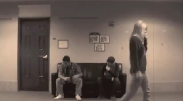
These are our joke videos. We made the first video “Ye Olde Waiting Room” as silence comedy video so we didn’t care the dialogues between characters so much. Instead of that, the setting, lines, character’s movements became important for this video.
Actual lines were easy to realize in this video. For instance, in the picture of beginning scene above, the frame of door, sofa, and pictures are very obvious actual lines. These lines gave audiences a sense of space.
Then the female looks up, her eyes was showing us the virtual lines. She was looking towards to something. Because we tried to use more establishing shots so this video didn’t include too many camera movements. We used characters’ movements to build up meaning.
In this scene, the female was pacing around, her movements provided us a rhythm and showed us meaning about she was waiting and worrying about something.
Also, we used the movements of pointer to show the time was passing.
In our second joke video “The Ole’ Switcher” we use dialogues and characters’ gesture to create the sense of the joke.
Again, actual and virtual lines were also used a lot in this video especially the virtual lines because we change the points of interest a lot in this one. We shifted our camera focus during the conversation between characters. During these close shots of characters’ facial expression, the audiences could see the lines of sight clearly. As different from another video, we provide more elements to show the space in this video.
In this scene, we would know they were in a lobby because the doors, elevator and crowed. Also the background sound helped us create the sense of space. In addition, the characters’ movements and moving direction gave us a kind of visual rhythm.
This is another example of space and rhythm. The wide shot showed us the character should in a hallway and the male was walking from far to close. We could realize the rhythm through his movements and his steps sound.
Overall, this video joke project gave me interesting and unforgettable experiences.
I went to Students Expo on Friday last week. It was hard for me to understand the biological and physical projects but I found the team from GRIDlab. They wer showing their game and so many students crowned and played. Also I was attracted by greenhouse invention. They used many products in stead of original decorative materials to gather and use more nature energy. In the end, I meet my friend Weijia who was majoring Electronic Engineering. He was showing a car robot with his partners. It was cute and so amazing.
In this assignment I choose a photo from Salvador Dali and reframe it in Photoshop. I cut half of the photo because I want to zoom in to the horse and emphasis more on it. The elements that I want to discuss in the original one and my reframing one is the direction of line, the way that people perceive the lines, visual movement and intensity.
The line direction in my reframing picture is horizontal. It cased on the horse’s head movement. It is jumping up and moving its head to left. Through the horse’s sight line we can receive the line direction. The visual movement is simple in my reframing one because it focuses on the horse mostly. The horse is the biggest object and it is on the most front of the picture. Based on that, when we see this picture we realize horse firstly and watch through its sight line to the elephants and girl behind it. I think my reframing picture seems free because the horse’s jumping pose. It has no much intensity.
The line direction in the original picture is diagonal. It starts from the man who is kneeling down, raising his arm and holding the cross to the horse. This line is moving towards to the horse’s head. It is moving its head to the left so it seems like it is getting hurt and trying to avoid the man’s stack. Also, the color of the man, ground, and the cloud are dark. The animals’ legs also show me the line direction. In addition, the dark color in diagonal position also creates line direction. Based on the line direction, people will follow the man’s pose and look from him to the horse; from ground to sky. This is one way that people receive the line. Moreover, the color different between the border of the frame, such as dark cloud and dark ground, and the center of the picture provides other way to people to realize the line. Based on the lines arrangement, the visual movement of this picture is complex. The man’s pose, the horse’s head’s movement, the horses and elephants’ legs are all showing us visual movement. I take woman who is standing on the elephant behind the horse as an example. Her is standing bias to her left side on the back. Her moving direction is same as the horse’s head. Even her hair is blown to left. These details create the horizontal visual direction to this original picture.
Over all, Salvador Dali’s picture has more intensity because the interaction between all characters in the picture. It also provides viewers more information about the story behind the picture.
This soundscape impresses me. The picture and the main melody of soundscape work in same function of showing “guilty”. The noise from forest in the beginning, the noise from water, the sound from thunder rain and the heartbeat in the end are separate sounds but they are linked and create the sad mood for the soundscape. The sound from the forest creates a wide feeling of space to me as a listener firstly. Then the sound from water creates a depth, it sounds like the people is falling deeper and deeper into the sea. The space becomes smaller. After that, the heartbeat changes the space to limited. It sounds like the people breaths harder and harder in the deep sea. Both of the sounds make me feel the changing of space clearly. As the background sounds change from forest to sea until the deep sea, I can also feel the time of the person’s movement. It sounds like he/she walks through forest then keeps walking to the sea. Finally he/she is sinking into the deep sea and his/her breath becomes harder. I can image that all of this person’s movement due to his/her guilty.
Mogan and Meghan’s Soundscape make me feel nervous and creepy. Even though I cannot distinguish what kinds of sounds you layered but they sounds similar ambiguous. The ring bell from the church provides me an image of space. Also, the all sound effects include echo so they make me think the space is opened. The different sounds changes based on a same temple and show me a sense of direction and movement. Furthermore, the basic temple sound starts with a low volume and becomes higher and sounds harder in the end. This change creates distance.
Maggie’s soundscape works well on creating the speed to show anticipation. The quick temple and pictures that have strong contrast give the similar motion. They make the temple quicker and quicker to create a sense of movement. Also the change of volume and instruments make me feel ambiguous. The fastest temple in the middle makes me feel the hard eager. I think the sound of electric guitar make the space limited. The sounds quality